

BI+Analytics icon library
Amazon Web Services | Vega Design System
Project: Vega Design System for Amazon QuickSight
Company: Amazon Web Services
Role: UI Designer, Iconography Lead, Component Designer, Documentation/Spec Writer
The product
In 2016, Amazon Web Services released QuickSight, a Business Intelligence (BI) and Analytics tool that enables customers to generate and view data visualizations via a single-view digital dashboard.
At the time of this writing, Amazon Web Services (AWS) dominates the cloud computing market at 33% share. Much of their success is attributed to a widespread offering of products and services, many of them created (or acquired) into Amazon-bespoke answers to customer needs. QuickSight’s one of these answers. Currently, it shares the BI/visualization market with other big-name tools, such as Microsoft’s PowerBI, Google’s Looker, and Salesforce’s recent acquisition of Tableau.
The challenge
With several other robust tools already available, QuickSight focused on what sets it apart: the pay-as-you-go pricing model and content embedding. The first is straightforward (no hefty annual subscriptions required here), the embedded element complicates. On a basic level, embedded means that customers can port their QuickSight dashboard content into their own websites. Functionally, it’s a great premise. Visually, this has often created unevenness between QuickSight’s native UI and customers’ own branding.
In addition, back when QuickSight was released in 2016, there was no official UX presence in its development. The engineers who built it pulled together a style guide for the app using various open-source tools and informal design knowledge. This sufficed as a fast solution as they readied the product for its first release – yet as QuickSight grew, its frontend codebase and look/feel expanded unchecked. As UI disparities increased, stakeholders’ desire to raise the aesthetic bar for QuickSight’s native app joined the desire for a seamless embedded content experience.
Market peers PowerBI, Looker, and Tableau were steadily adding to their visual offerings. In general, consumers have come to expect increasingly well-designed app experiences. The QuickSight team needed to make some moves to remain competitive.
Enter the creation of a brand-new design system, called Vega. A single-source-of-truth for thoughtfully crafted code components and a unified visual language. With guidance from a now well-staffed UX/UI/Engineering team, QuickSight could be migrated into this system and scale its offerings in a more cohesive, visually-delightful way.
My role
My reach across Vega Design System is definitely varied; I’ve served as a core designer for its first and subsequent releases. My contributions included:
~20 unique components and their multiple sub-variants
Color/theming guidance
Usage documentation
Redline/blueline specs
Guidance and adoption strategies for UX designers and engineers during the implementation phase (including contribution models, office hours, lunch-and-learn shares, and formal/informal design reviews)
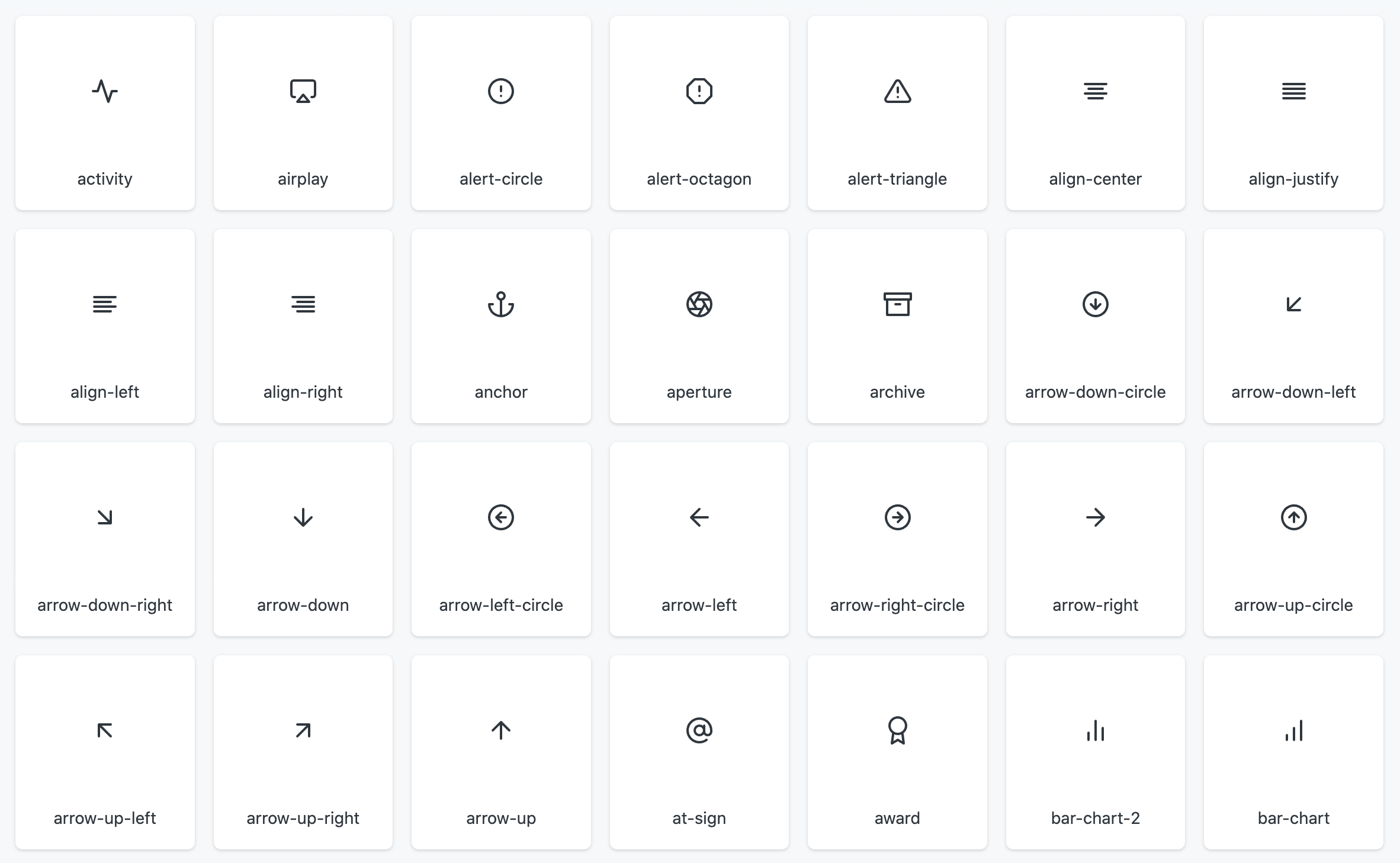
Full design of a 187-count icon set
For the sake of brevity, this case study focuses on the last bullet: my creation of the full Vega icon library.
Research
Two scopes of research guided icon development: general design system-based and iconography-focused.
Design system-based
My comprehensive audit of 14 different design systems, 10 internal-to-Amazon and 4 external systems
Team review of open source materials we could leverage into a new system, such as knowledge from Google Material and IBM Carbon
Stakeholder interviews
Customer click/heatmap tests
Card sort exercises
A/B testing and demos of conceptual UI’s during the AWS Re:Invent 2020 conference
Iconography-focused
Audited QuickSight’s existing icon set
Collected icon-related feedback from a product-wide UX audit and baseline usability test
Checked against existing product feature workflows to see where there are opportunities for missing icons, or for existing ones to be simplified
Internal/external customer interviews
Icon design conceptual reviews with peers/stakeholders
Evaluation of icon-specific open source materials that could be leveraged into the new system (Google Material, FontAwesome)
The design process
Based on the research findings and the need to deliver a first-release system as soon as reasonably possible, the Vega team adopted a fast-follow approach. Our team leveraged boilerplate elements from other design systems that then could be crafted into a unique visual language. I extended this strategy to icon development.
My design approach to these consisted of three parts: the icon grid from Google Material, the simple stroke outline aesthetics of Feather Icons, and some proprietary adjustments to give them a unique Vega fit-and-finish.
The icon grid
I used Google Material’s 24x24 icon grid template to ensure consistent size and visual rhythm across each symbol. Examples of Vega icons applied to the grid below:


Simple outline-focused aesthetics
I sought to keep the icon forms as minimal as possible. Solid strokes, simple lines.
Some symbols that are relevant to the BI+Analytics space, like datasource or charting icons, may appear more abstract to novice users. I didn’t want to complicate a complex concept with unnecessary visual add-ons, like variable stroke weights or different colors within the same icon to separate shapes.
The open source Feather icon set was a heavy inspiration for the icons’ core look:
The Vega spec
I set up specifications that would establish a consistent, specific, and signature Vega icon style:
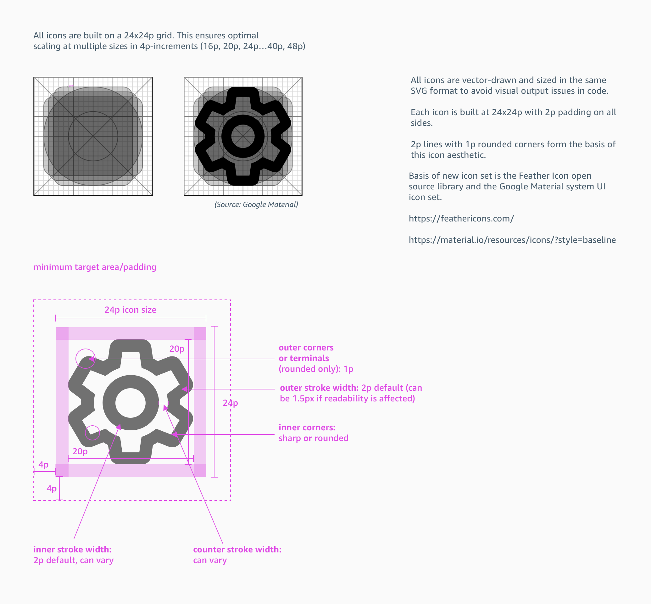
Snapshot of spec as outlined in my stakeholder/design leadership share-out
Creation, review, and refinement
From there, I worked with the UX design team and senior leadership to align on the correct representation for each symbol. I made additional steps to ensure the issues with the existing icon set were understood. I worked to build trust with stakeholders by capturing their feedback from prior design reviews, with proposed solutions for each feedback point. My review materials were set up to ensure that no single icon’s details went unnoticed:
From there, these were the very first elements from Vega Design System to be officially implemented into QuickSight:

Aside from ongoing updates to QuickSight’s UI as needed, the Vega icon library is catalogued via a Figma sticker sheet and Storybook code repository:

Summary
QuickSight, Amazon’s go-to BI/analytics/data visualization tool, required a significant visual overhaul to remain market-competitive. This was addressed in large part by my team’s creation of Vega, a design system crafted to serve UI’s of variable visual complexity and increased data density – particularly as presented in BI tools. As part of establishing Vega, I was responsible for the creation and launch of a full 187-count (and counting) icon set. This icon set was the first aspect of the design system to be migrated into QuickSight.
My biggest challenge in this project was resisting the designer’s impulse to creatively reinvent the wheel, so to speak. UI’s in general have reached a point where many symbols are common – home (house), settings (gear), more (ellipsis/kebab), to name a few. To choose symbols that vary from these common meanings could risk making customers’ tasks harder due to the time they spend trying to interpret them. In an effort to stay true to a UX designer’s imperative to make UI’s easier to navigate (or less annoying, at minimum), I made it a point to seek visually-common elements and afford clarity to the more complex ones.
As for my biggest success? I’m glad that this icon set was the first release of Vega into a general audience. I’d like to think it paved the way of enthusiasm for some of the UI migration efforts that followed. Most importantly, this project reinforced my belief that a solid visual language—from the icons, to the color selection, to the micro-interactions—are big in establishing customer trust. It’s indicative of caring about the details. It’s a reminder, particularly in Visual User Experience design, that style can be just as important as substance.
Next steps
As the first Vega integration into QuickSight’s UI, this icon set received positive user responses overall in Preview testing and GA (test data available upon request). The set continues to grow with new additions, averaging 2-4 unique icons per monthly release. QuickSight has since migrated its Reader (view-only) dashboard to Vega. The product is on track to be fully-migrated by the end of 2023.
Due to the Vega icon library’s comprehensive catalog of symbols pertaining to BI+Analytics content, it’s set to be integrated into at least two other company-internal design systems. This will potentially extend the icon library’s reach into several other Amazon-based products and services.