


Accessible color theming
Dell | Skyline Design System
Project: Skyline Design System
Company: Dell Technologies
Role: Lead Designer
Full project: Link (opens a Figma repo)
The product
When I joined the Dell EMC Isilon storage group in 2017, "design" in this engineering-dominated organization meant something entirely different than it does today. Back then, it almost exclusively referenced activities like mapping a hardware build or composing efficient code. In that sense, the engineers who build Isilon products are excellent at design.
Isilon is a family of scale-out network-attached storage systems that store massive amounts of data at the enterprise level. Universities, financial institutions, arts & entertainment studios, government offices, hospitals, and even the Vatican keep their data stored on this hardware. All for good reason, as Isilon has long been the #1 product in its industry. It just won an Emmy Award. There's a lot of user confidence in this brand, so Dell EMC Isilon established a brand-new User Experience (UX) team to help keep it.
The challenge
Here's where I came in. When I joined the UX team as the sole (and Isilon's very first) Visual Designer, it was my job to establish a style guide/pattern library that would provide visual cohesion to Isilon’s user interfaces.
The organization's software desperately needed a more unified visual experience. Since its founding in 2001, Isilon UI design had been driven exclusively by developers who, understandably, prioritized good code and build reliability over streamlined looks and user-friendliness. Intentionally or not, this stuff was built by engineers for engineers. For users that aren't fluent in storage admin-speak, that meant trying to manage their Isilon hardware in an app with a lot of esoteric language, confusing navigation, and over-complicated workflows for getting something done, like doing a upgrade or checking if their storage cluster is still functioning.
This is expensive, high-powered hardware meant to keep massive amounts of important data safe. That idea's daunting alone! If a person doesn't consider themselves an expert in this space, trying to navigate an app that controls this hardware could seem downright scary.
The problem was clear. The UX team had to find a balance between appealing to newer users while still honoring the expertise of our veteran users, all while reinforcing the main idea: your data is safe here.
The UX team had to find a balance between appealing to newer users while still honoring the expertise of our veteran users, all while reinforcing the main idea: your data is safe here.
Our starting vehicle for this plan was to revamp Isilon's InsightIQ storage data monitoring application, already several versions into existence. My task as Visual Designer was to bolster ease-of-use by modernizing the app's look while paying extra attention to its visual accessibility.
The kickoff
The usual first step in How to Build a Style Guide is to take inventory of existing patterns and revise them into the new system as appropriate. Given the many inconsistencies Isilon UI’s accumulated over time, my directive was to start from scratch. Fortunately, full stakeholder buy-in was already in place. This allowed me a lot of creativity and autonomy in my approach.
To get things rolling, I utilized research to gain a broader knowledge of the business, concept definition to pioneer a visual look and feel, and team alignment to support my strategy:
Research
Being new to the enterprise-level storage space, I sought a better understanding of how data storage and the existing app works. Tools I used:
Support documentation
Online video walkthroughs
Informal competitor analysis
Internet databases/wiki’s (Stack Overflow and TechTarget were big favorites)
Acquired qualitative data from our UX researcher to get an idea of existing expectations, which included:
Heuristic evaluations of existing Isilon products
Personas
User interviews (directed, non-directed, and ethnographic)
Studied complex dashboard UI’s via multiple sources:
Old-fashioned book learning; Edward Tufte’s The Visual Display of Quantitative Information and Stephen Few’s Information Dashboard Design are standout classics for best practices
UX industry blogs and mainstays that have driven the field forward, including (but not limited to) Nielsen-Norman Group, Google Material Design, Airbnb, UXPin, Usability.gov
Concept definition
I used this part the process to gauge the creative “feel”. A data-heavy application with lots of nerd knobs and buttons can still feel great when done right. This is tough to capture, so I spent good time in the conceptual phase for this project.
Met with stakeholders (directors, project management, UX leadership) to invite creative discussion of what they envision for this project’s success.
I toured our building’s tech-heavy operations rooms to better convey the environment. The sheer amount of power, connectivity, moving parts (and loud fans) in a data center is astounding. I wanted to convey that technical gravitas in our UI’s in a way that was electric, gratifying, and just plain cool. Given what this hardware is capable of, it definitely is cool.
Browsed mood boards and design inspiration websites.
Riffed with various coworkers, both direct and indirect teammates, on early concept ideas to gauge reception.
Composed my own concept boards to share ideas with my team.
Team alignment
Weekly check-ins with my team and direct leadership.
Solicited feedback from teammates on my research findings to fill potential knowledge gaps.
Pitched my initial strategy to the team to set initial expectations and establish a cadence for review sessions.
The design work
(a.k.a. the movie makeover sequence)
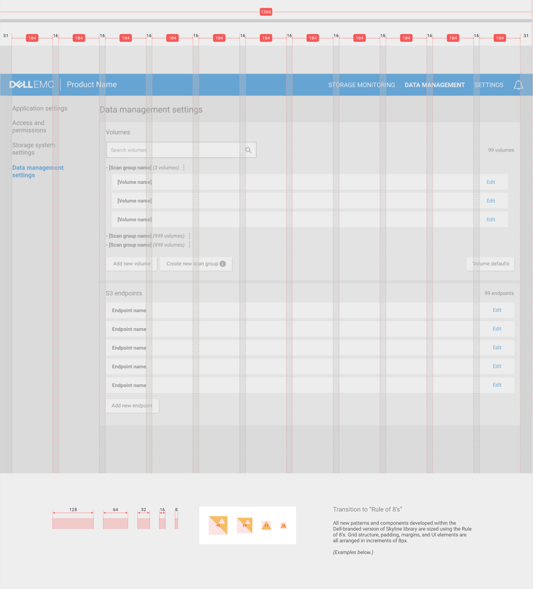
Our team’s Lead Interaction Designer and I, well, teamed up. We used the legacy InsightIQ app (pictured left below) as our starting point. Partnered in constant feedback, work sessions, and file-sharing, our domains were clear; hers was interpreting our lead researcher's user data to determine new workflows, UI components, and reorganized features. Mine was tearing down the existing colors, logos, fonts, navigation styles, and content hierarchy and replacing them with visually-enticing, user-focused versions. Our shared efforts bore fruit with the start of a new, complete app redesign.
Spoiler alert — this is where we ended up:
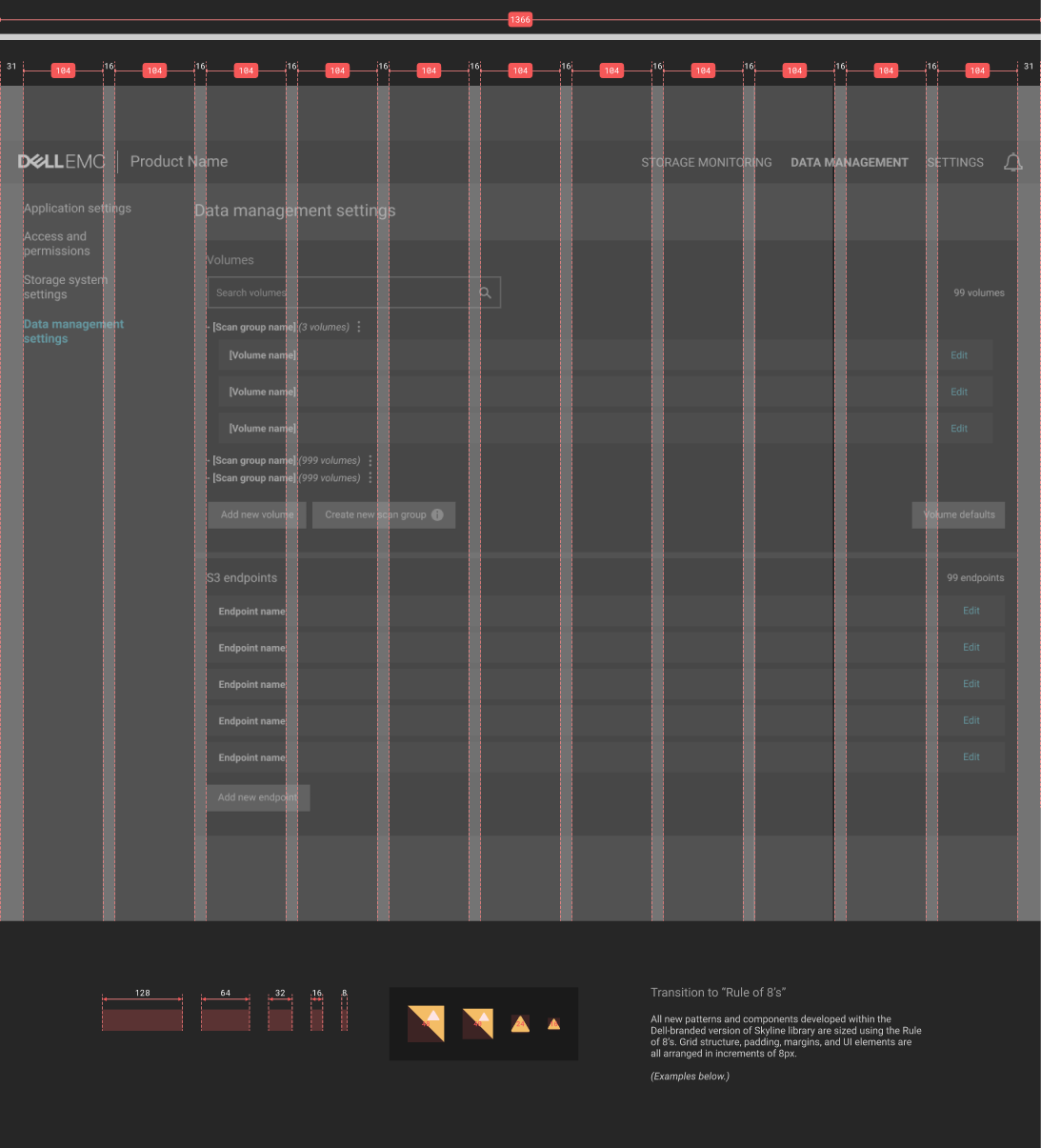
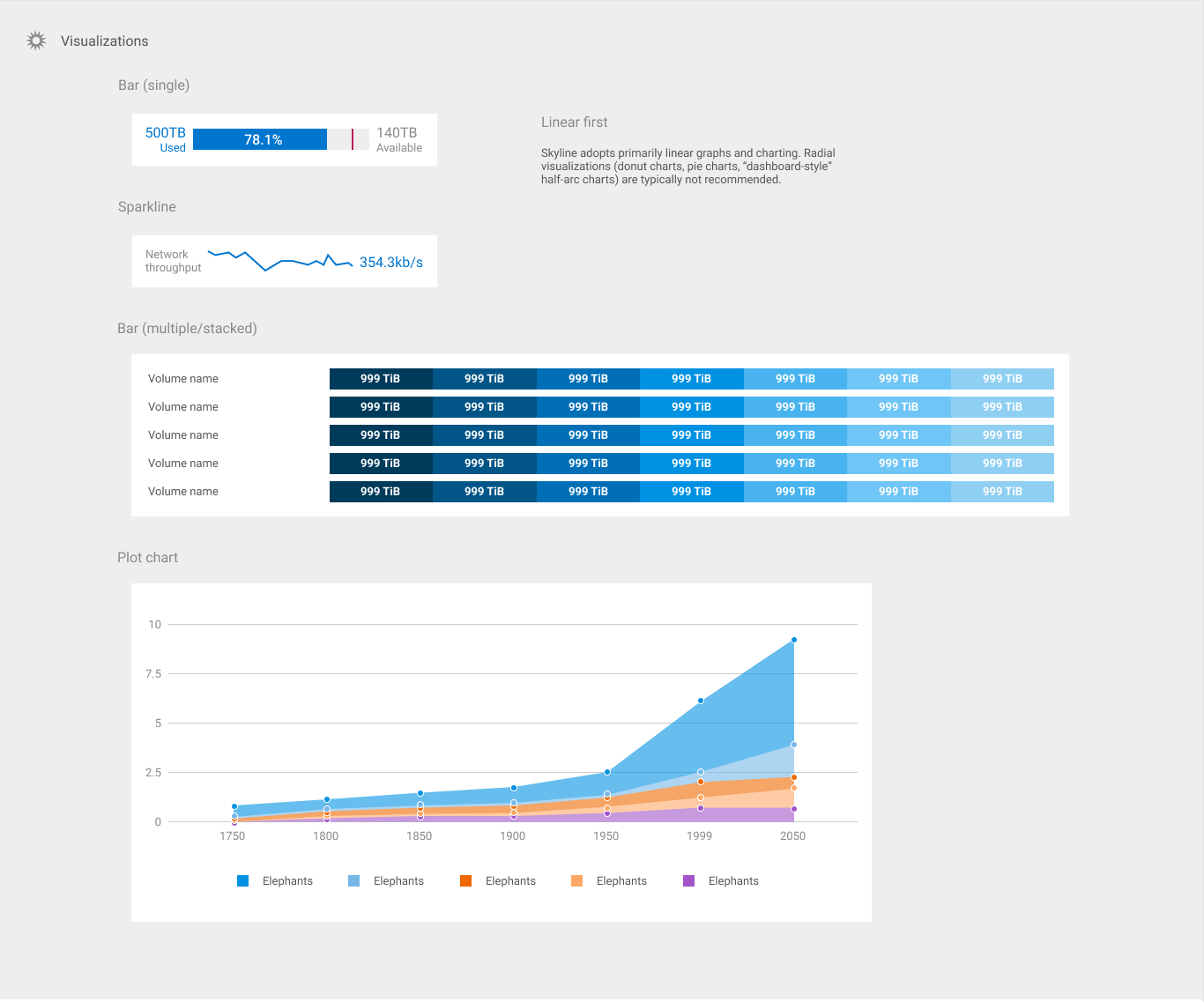
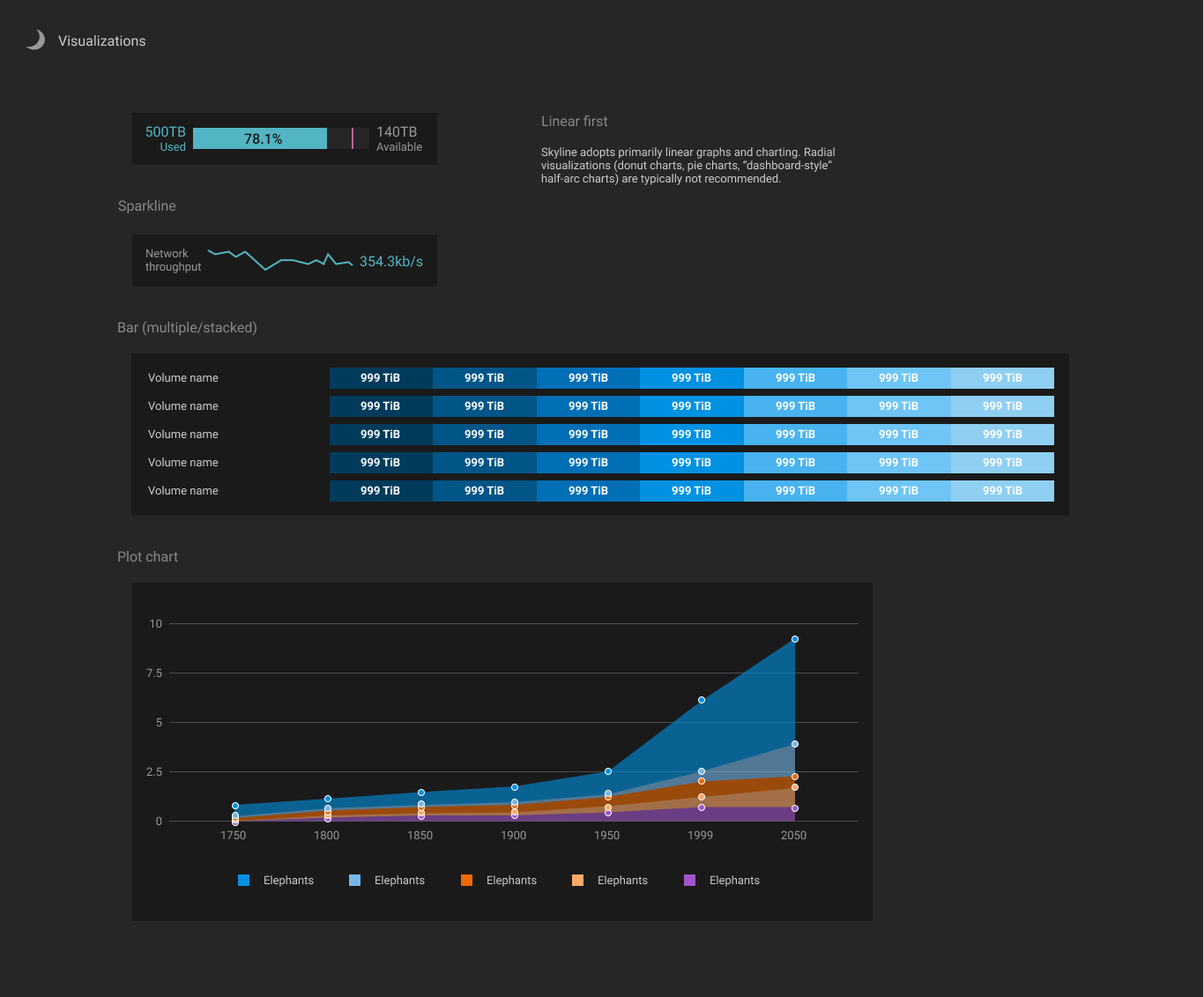
We could spend all day here talking about how each component of the design system was delivered, but that would be a lot of scrolling. I’ll cover a major aspect of my work on Skyline — its dual-theme color palette.
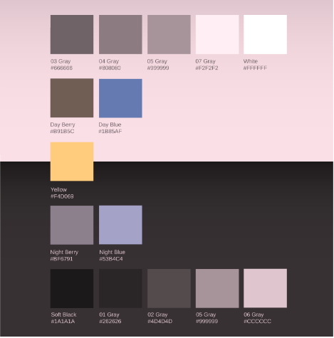
A tale of two themes: my key dual-palette principles
Monochrome minimalism
Color to indicate, not decorate
Counterparts for all
Accessibility wins
Let’s dive into what these mean:
Monochrome minimalism
Using grayscale or monochrome for the base palette provides versatility. I was able to use some of the same swatches across both themes.
Only include as many monochrome options as minimally necessary. If a designer’s worried that they won’t have enough options to service their design, it’s important to remember that there are many tools beyond color to separate UI elements. Consider manipulating line, shape, and placement within a component before adding another swatch to the palette.

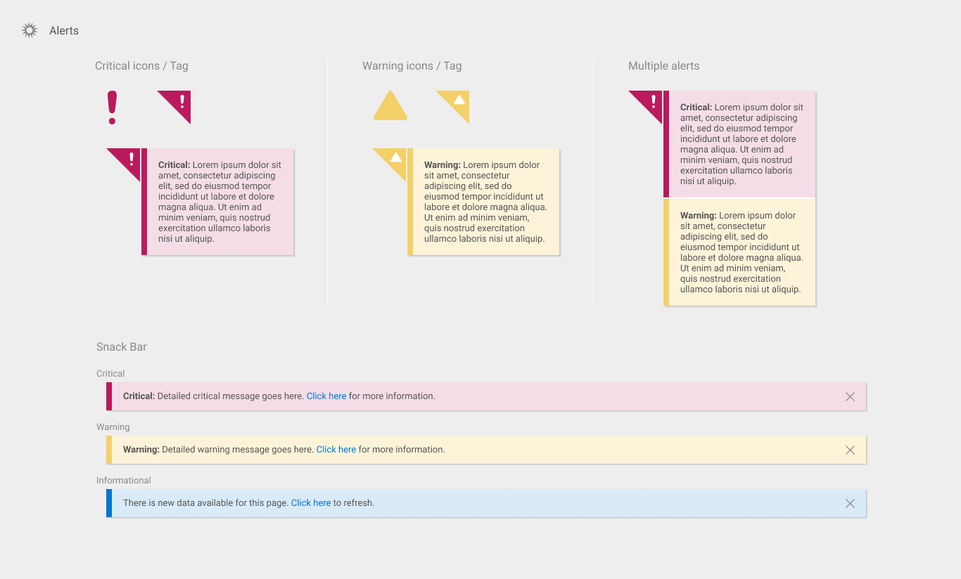
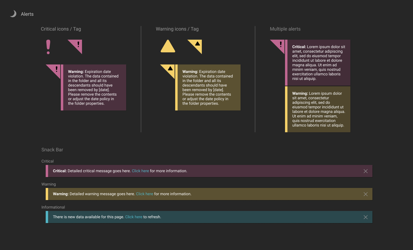
Color to indicate, not decorate
Used very selectively, color is a powerful tool for calling attention. Using that power for decorative purposes can lessen the meaning of status indications, which can be dangerous in a monitoring dashboard.
In this guide, only alerts and active states get bursts of color.


Counterparts for all
If any element exists in one theme, it has a counterpart in the other theme that serves the same purpose. This makes theme-swapping while building hi-fidelity designs (and setting up the CSS in the code later) much easier.

Accessibility wins
Due to various types of colorblindness, not everyone can view color in the same way. In a UI driven by color-coded status updates, ignoring this fact can also be risky. Especially since users for InsightIQ rely on these indicators to monitor storage cluster health. It was important to run the palette through accessibility checks to ensure it was easy on the eyes for as many people as possible.
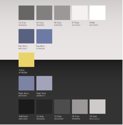
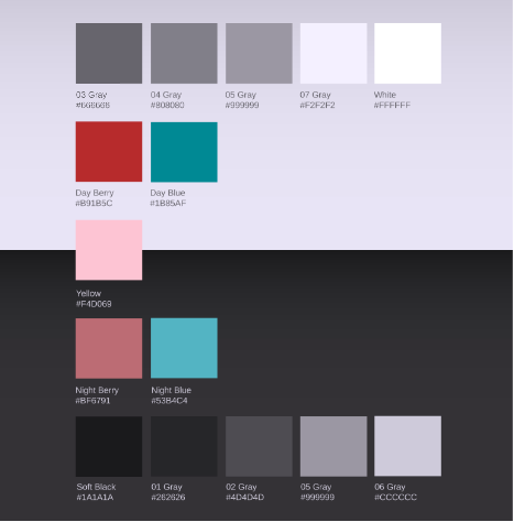
These checks include looking at contrast values of text color against background color:
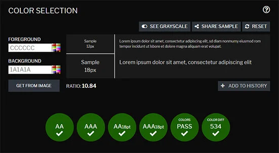
Or taking passes through colorblindness simulation filters:

Putting it all into practice
Rolling these principles into one made for an easy switch between the two looks! Aided by the UI components that the Interaction Designer and I also designed, I created hi-fi mockups of what resulted:
My favorite takeaway from this project was during my pitch of the hi-fi mockups above to InsightIQ’s product management. One leader voiced out loud (to summarize):
“I’ve always had a hard time viewing color differences in computer applications. Not a lot of people know I’m colorblind. This is the first time ever where I can actually see what’s going on.”
The summary
The goal was to create a style guide and patterns library that would improve the visual experience of Isilon software products. The challenge was to make it appealing and accessible for users of all experience levels, in intuitive user interfaces that reassure this main tenet: Isilon products keep data safe and secure.
Leading the build of a style guide was no small undertaking. I learned how to drive this process independently and lead the organization’s visual design strategy. I gained a lot of experience pitching creative work to engineering-specialized audiences (especially those who don’t consider themselves “creative” or “designer-y”). I worked to prioritize visual accessibility and present data that’s easily consumable; a tough job in a complex application.
As Dell EMC Isilon advances as a storage technology leader, the opportunity for creative progress is high. The efforts made here are meant to drive forward the way enterprise-grade UI’s are designed.
The next steps
When I began working at Isilon, the organization functioned as a standalone subsidiary of Dell EMC. Since then, it’s been re-branded as a member of the Dell Technologies portfolio. The most recent version of the complete design guide reflects this transition-in-progress to Dell branding.
As this re-brand continues, Skyline is set for absorption into the larger Dell Design System (DDS). The next steps I’ve proposed for this are in progress:
Skyline documentation has been shared with the DDS design team, encouraging relationships, transparency, and feedback.
Inventory of Skyline and DDS patterns has been taken to see which can be integrated, replaced, or introduced.
The dark/light theme design process is being used to inform the next version of Dell Design System.
Isilon applications will adopt the look and feel that result from this integration, contributing to a more unified look across Dell’s product portfolio.